WUHAN VIRUS DAILY UPDATE FOR APRIL 28
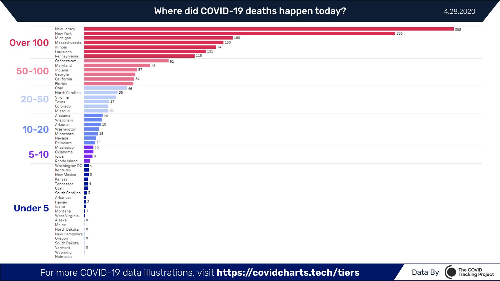
MORE PEOPLE DIE ON TUESDAY, BUT LESS THAN PRIOR ONES. Weekend data reporting latencies seem to always catch up on Tuesday so our numbers did go up - but they went up less than ever before. In fact, this is the first Tuesday that hasn't set a new record high - great news! Why is this? Well, it looks like NYC is finally accellerating its curve downwards. Peter Walker, whose charts I've referenced before, shows that, for the first time, New Jersey has overtaken NYC is actual deaths per day.
Sadly for NJ - their numbers are going way up despite their strict isolation policies. This supports the expectations, agreed to by all models, that isolation does not stop the virus, it just flattens the curve over a longer period of time. Whether it's an effective mechanism or not involved a lot of other issues but the evidence thus far suggests strongly that it is ONLY justified if the local heath care system is overwhelmed due to too many patients. Instead, what America is experiencing is that health care workers are being layed off because of too few patients. This STRONGLY argues for getting hospitals reopened to full operation immediately to offset the inevitable impact of 2nd and 3rd order effects. And people will NOT go to receive their needed health care so long as the rest of their region is under lock down. The ONLY responsible action for 99% of America is to fully open now - each day's delays is incredibly costly in terms of lives lost or ruined.
Our new total for incidents is 1,005,592 (+24,458 - congrats to Adam Nyback for his precient prediction!), an increase of 2.49% over the previous day (+0.19% from yesterday). Deaths have totaled 52,525 (+2,198) which is an increase of %4.37. (+2.00%) over the previous day. Since the peak in Mar 19, rates of growth for incidents has fallen by 49.14% and for deaths has fallen by 38.49%.
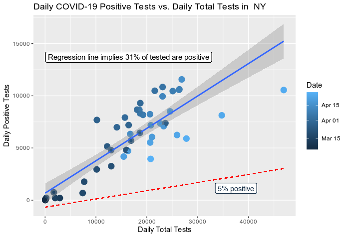
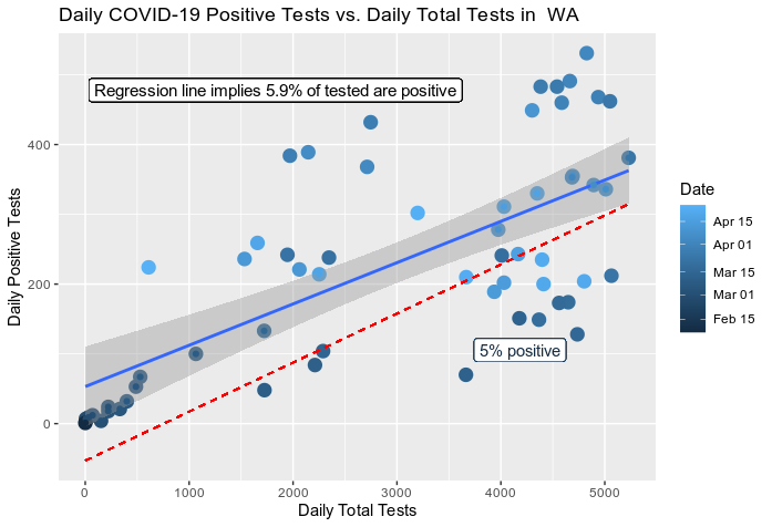
On Tuesday only 202,362 tests were completed. That's rather disappointing and entirely inadequate for determining how many new cases there are each day. I've argued before that the data has demonstrated that our ability to detect new cases has been ENTIRELY limited by testing capacity and therefore our count is significantly lower than reality. Well Paul Bleicher has published some great graphs using the same Covid Tracking data source as me that demonstrates this fact most clearly.
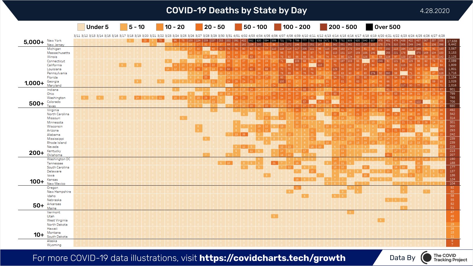
Peter Walker, has another excellent chart showing deaths by day for each state:
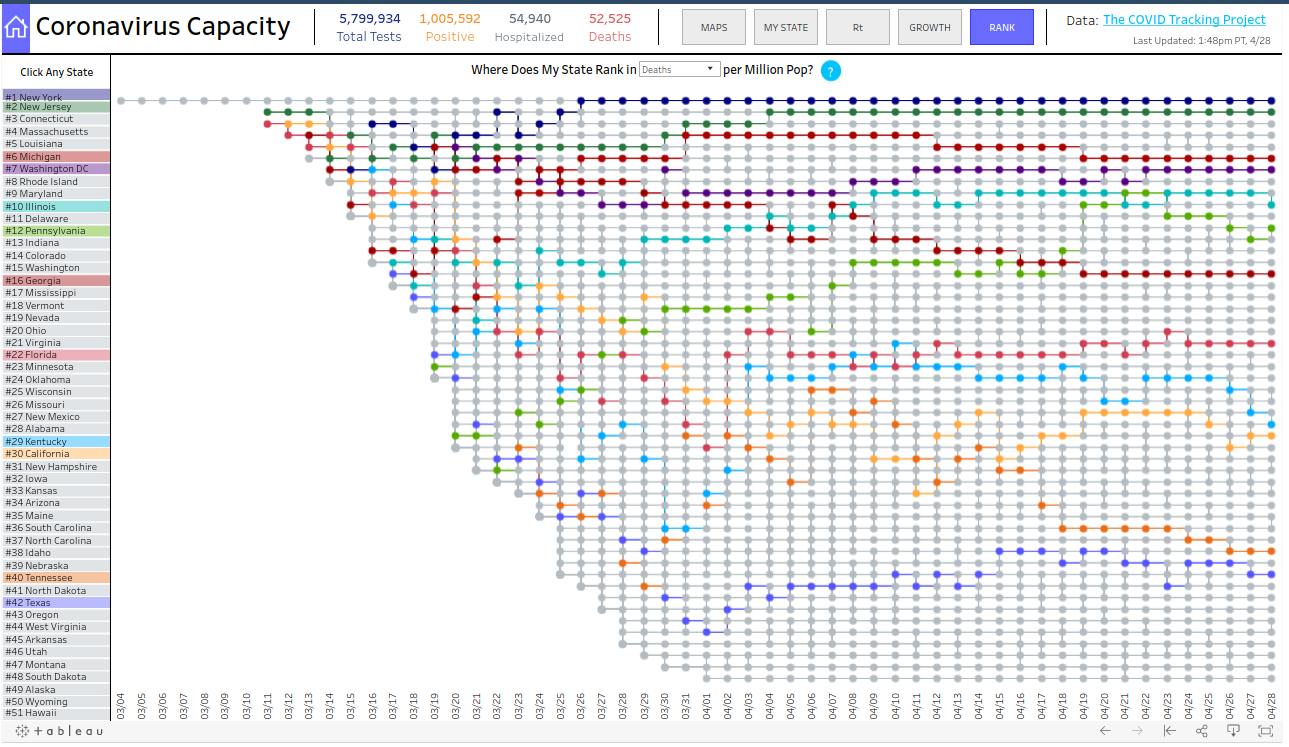
And here's one that shows the rates on a per capita basis which I find to be the most meaningful one. It's kinda hard to read but if you click on the link just select "RANK" view on the top right to see this actual graph.
In conclusion, for the vast majority of America, the news is quite good. It's clear that we need to be getting back to normal and we need lots of frequent randomized testing in various regions so we can track this pandemic and it's spread. So far, everyone who has reviewed my recommended path to reopening, has had positive feedback. I wish we'd see some governors and mayors adopt it. Instead, places like Hawaii, absolutely the lowest death rate in the nation, are doubling down on their lockdown and are absolutely going to bring a lot of needless pain, suffering, and death to its citizens. This is remarkably immoral and unethical. I guess the citizens are going to just have to take back their human rights to hard way when governed by these newly minted tyrants. Take care.