WUHAN VIRUS DAILY UPDATE FOR MAY 5
"TRUING UP TUESDAY BUMP" TREND STILL DOWN. As predicted, a lot of "held back" numbers came in from various states, especially Pennsylvania who reported 554 deaths today and New Jersey with 334 deaths. New York continues its decline to only 230 deaths. PA seems to do this every 7 days like clockwork but this is their highest. Normally they're about 60-ish per day. Despite all this "truing up", the trend remains solidly downward as we expected.
Our new total for incidents is 1,195,605 (+22,348), an increase of 1.90% over the previous day (+0.06% from yesterday). Deaths have totaled 65,307 (+2,501) which is an increase of 3.98% (+2.47%) over the previous day - scary big for reasons we described above but the moving averages are still clearly downward. Since the peak in Mar 19, rates of growth for incidents has fallen by 49.73% and for deaths has fallen by 38.88%. There were 258,992 tests completed with a 8.63% positive rate - another two week record low.
The surprise trend thus far is Michigan which, along with Illinois, were most likely to be the next hot spots. Michigan is showing a surprise downward over all curve as you can see here:
Michigan's Downward Trend
![]()
The fear of big new secondary curves has, so far, not manifested itself. Apparently these cities don't have the population density to hit the kind of high numbers in New York and New Jersey. They still are fairly hard hit but it appears, as Dr. Levitt has been saying since the beginning, that this virus burns itself out on its own fairly predictably.
The news media, however, is pushing the narrative that new incidents are going up up up! Of course it's true because our testing capacity is finally going up up up and, as I've documented here several times, our rate of new incidents has been entirely bounded by our testing capacity and has very little to do with the real number of new cases. The NY Times has been demonstrating it's willingness to lie with graphs but got called out by Peter Walker today with this set of graphs:
Peter Walker Demonstrates NY Times Deceiptful Graph
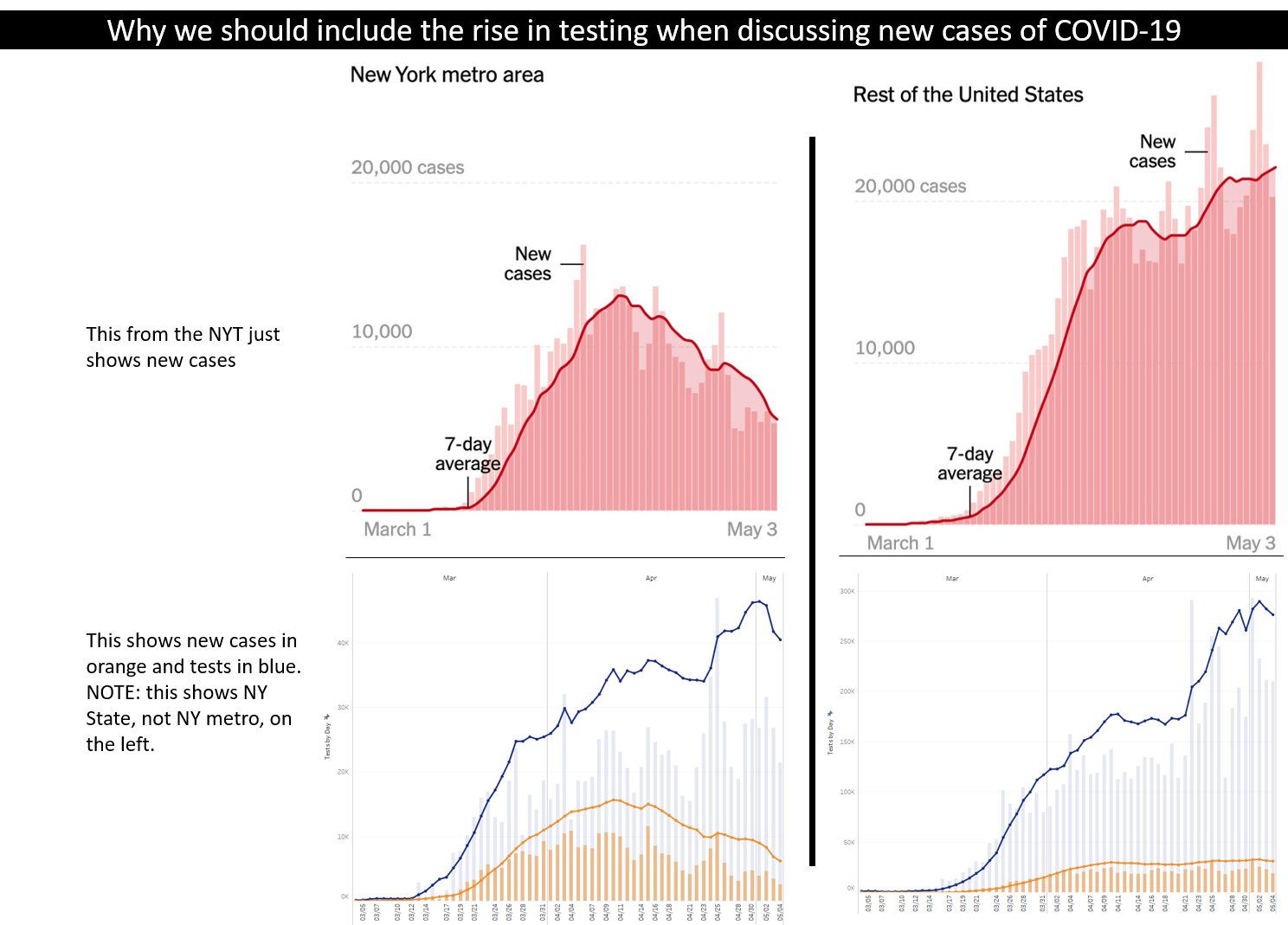
Note the big scary pink charts on the top from the NY Times showing a clear downward trend in New York but a shockingly large upward trend in the rest of America. Well below, the graphs by Peter Walker, put this growth into perspective when you show the rates of increase of testing capacity. Our testing capacity has gone way up by several multiples but the % positive rate has radically dropped so that actual numbers of "new confirmed cases" has only gone up a bit relative to the testing. This means that our testing capacity is finally outpacing the growth of new incidents of the virus. Completely good news. But not if you're the NY Times and want to push a fraudulent narrative of FUD.
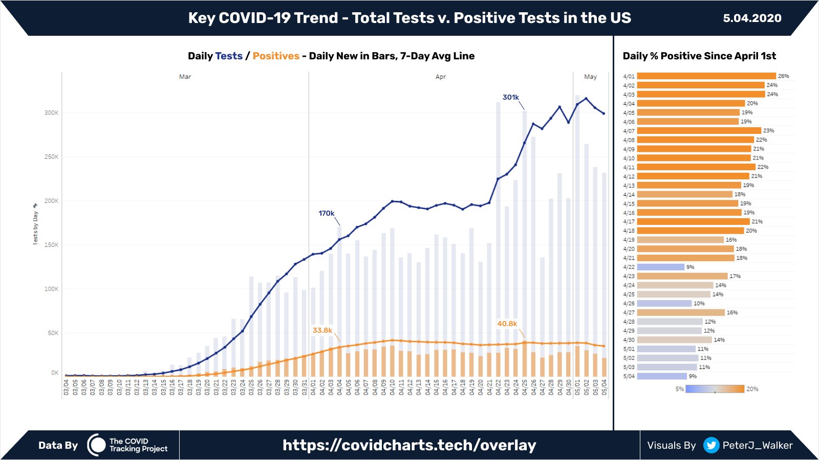
Peter shows two more useful graphs to get a handle on this testing business. The first is a bigger version of the same data as the prior graph. Note the graph on the right showing the decline in % positive rates. The vast majority of these tests are for symptomatic people. Now under 10% of people with symptoms are actually testing positive. We're back at the early March stages when more than 90% of the people with symptoms actually did NOT have the virus active.
Peter Walker Total Tests vs. Positive Tests in US
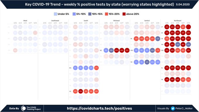
So where are the states that still have high rates versus low rates? Peter's next graph shows, as we described before, it is primarily based on the state's vicinity to New York and New Jersey. Quite natural that they'd have the highest positive rates but note that these are still just in the 20% range and even they are going down for the most part.
Peter Walker Positive Tests by State
The next few days will help define the curve's trajectory better. We should be down to about a 1.50% death ROG by mid May. By May 9th whichever side of 2.00% death ROG moving average we are at will more clearly define the shape of the curve. April 1st was a 24.66% rog moving average and May 1st kicked off with a 3.99% rog moving average. Today we're at 2.47% rog moving average. When these North Eastern states burn out and start their declines expect it to go down fast.